MLB Home Run Derby
Vision + UX Designer
2023
Developed a Home Run Derby mobile experience to serve as a digital companion for the live event.
Concept
An interactive "secondary screen" for the MLB Home Run Derby to enhance the viewing experience for fans, providing real-time updates and in-depth tracking analysis of each player’s performance, as well as showcasing detailed profiles of each participant, to fit seamlessly within MLB’s existing suite of digital properties.
Goals
Empower the user and alleviate existing negative sentiment due to recent changes in the format of the event creating a less-than ideal viewing experience for television audiences.
Software

Context
What is the Home Run Derby?
It’s an epic battle of brawn and skill, where the goal is simple: hit as many home runs as possible, more than your competitors in each round, and claim bragging rights as the king of the long ball. The event is held annually during the Major League Baseball All-Star weekend, where 8 players are invited to participate in a bracket style tournament, and the winner takes home $1 million.
Research
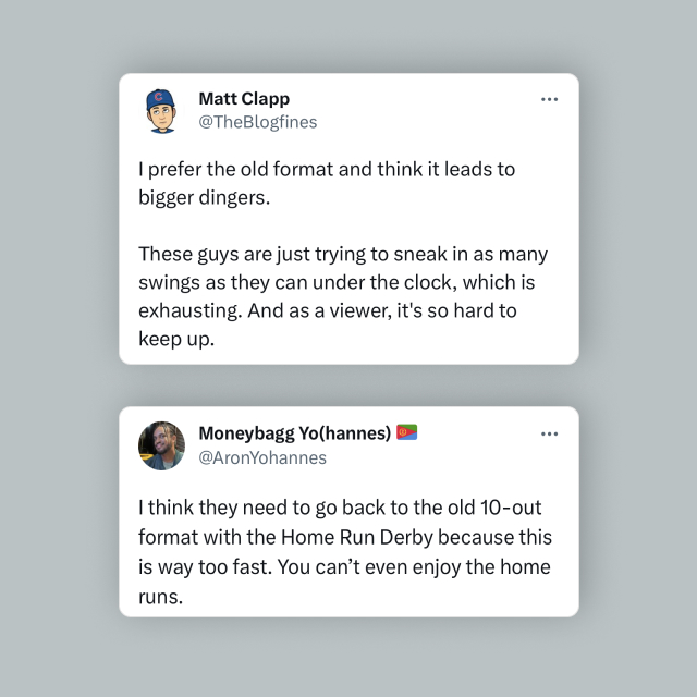
Current Viewing Sentiment
Recent changes in the format of the event has created a less-than ideal viewing experience for television audiences and the MLB has not taken corrective action to mitigate these issues through their existing digital platforms. The following is a summarization of my findings from online social response (e.g. Twitter & Reddit):
Event Format Changes:
Each player now has 3-minutes per at-bat to hit more home runs than their opponent in each round. Formerly, players had “10 outs” before their round expired. An out qualified as 1) any swing and miss or 2) any non-home run hit. Hitters are no longer selective in the pitches they hit in this race against the clock.
Effects on Broadcast Coverage:
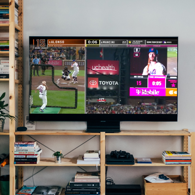
By being selective, the slower pacing of the event between home runs allowed viewers to really follow and enjoy each hit with corresponding television replay coverage. Now the speed of the event has required a split-screen view (one camera focused on the player swinging and one camera tracking the location of the hit baseball). The mental gymnastics required to follow both simultaneously is a difficult and hard-to-keep-up experience, especially when the player is already swinging and hitting another pitch before his most recent homerun has landed in the stands, with significantly fewer replays.
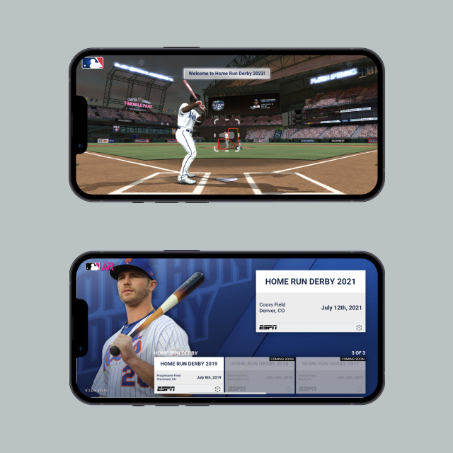
Irrelevant & Unhelpful MLB Apps:
Surprisingly, despite the suite of MLB apps there is not one that provides coverage for the live event to serve their digital audience. The existing MLB Home Run Derby app is a video game for users to hit virtual home runs, but has no grounding for the live event. Meanwhile the MLB app, an impressive encyclopedic resource for all games played, player statistics, and general conversation about the league, did not provide any live tracking or coverage.
Opportunity
A dedicated mobile application to serve as a digital viewing companion for the live event.
My proposal included the following core features to empower users, otherwise disgruntled by the current viewing experience:
MLB Branded
Trusted
Live Scoreboard
Engage & Inform
Leaderboard
Build Anticipation
Player Profiles
Discover & Learn
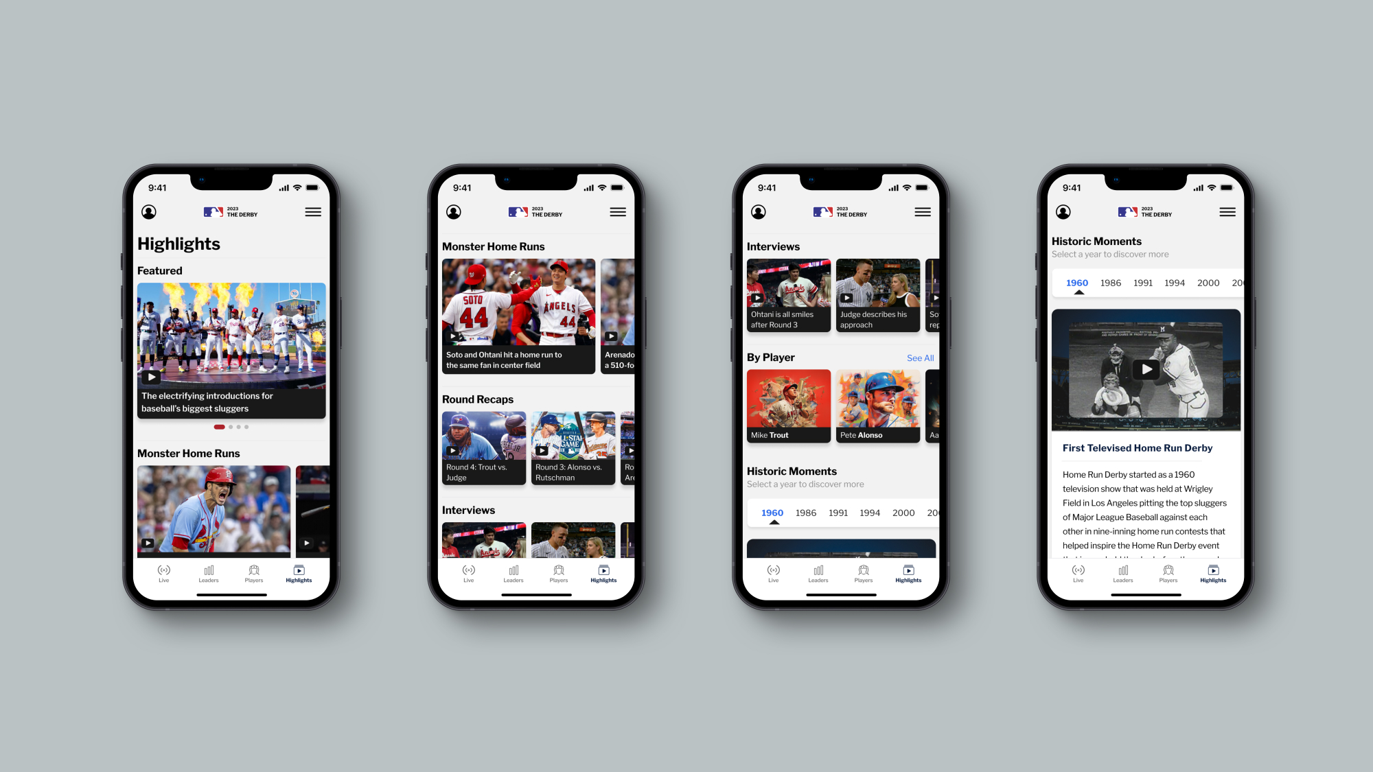
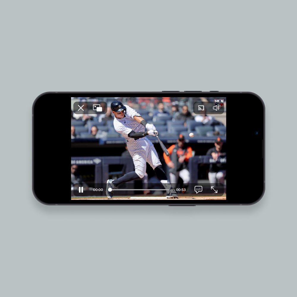
Highlights
Relive & Reshare
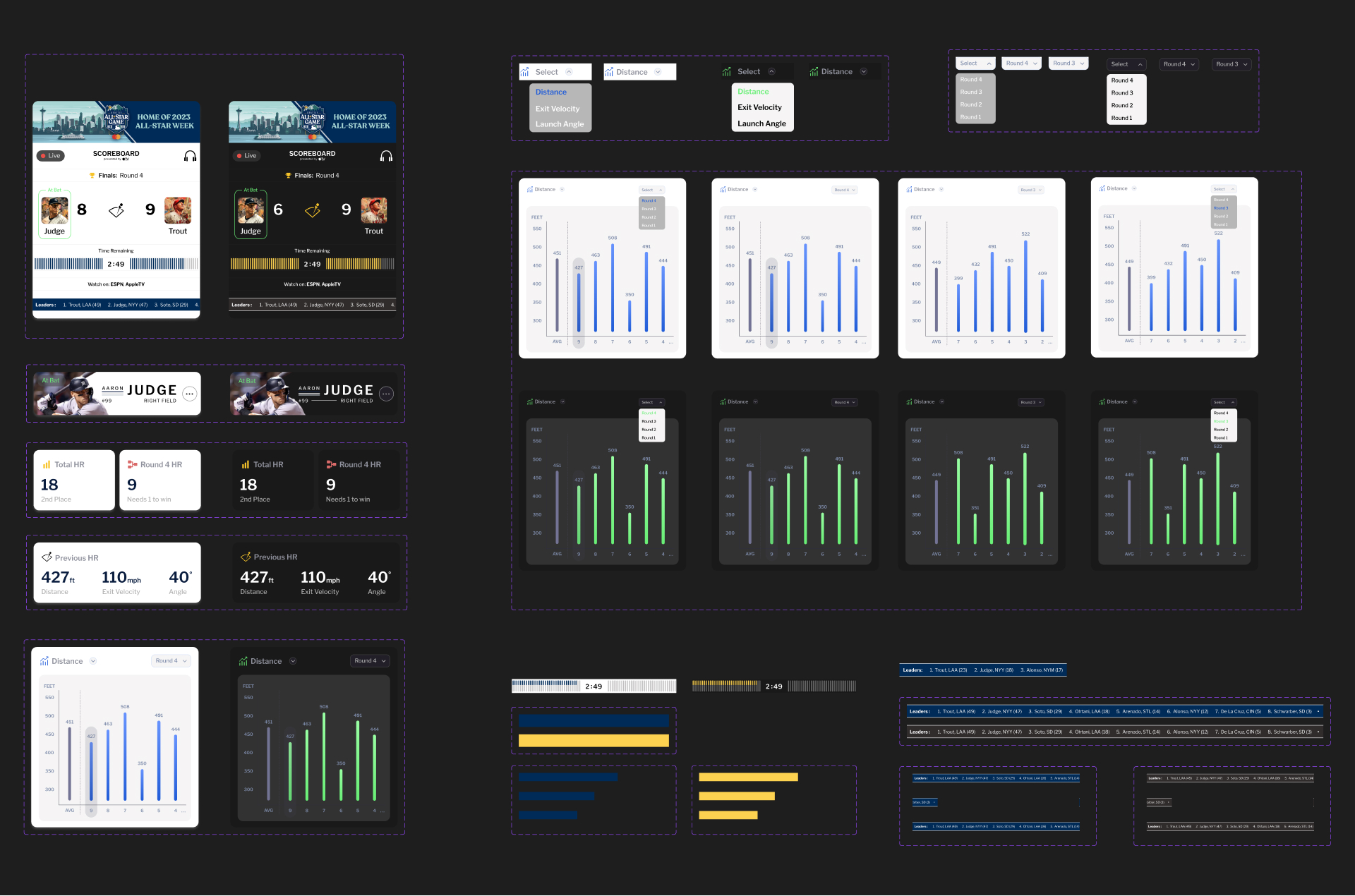
Design Process
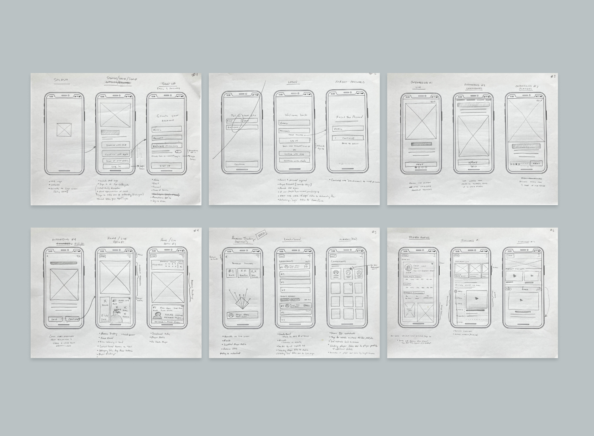
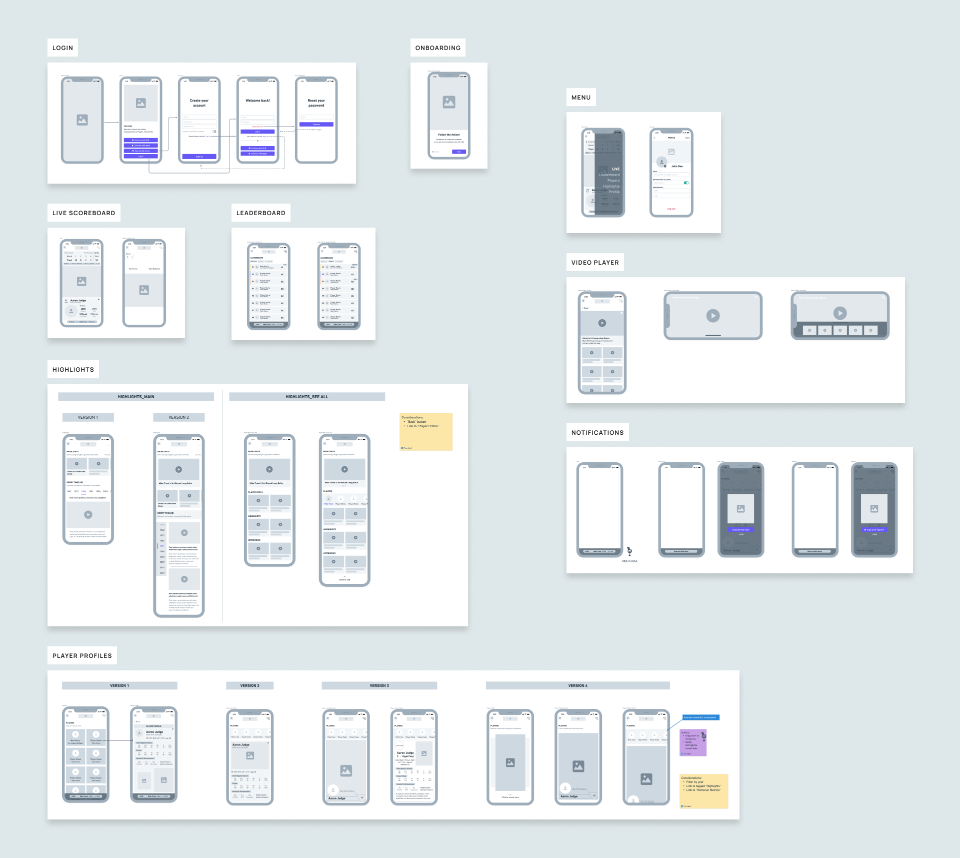
Sketches & Wireframes
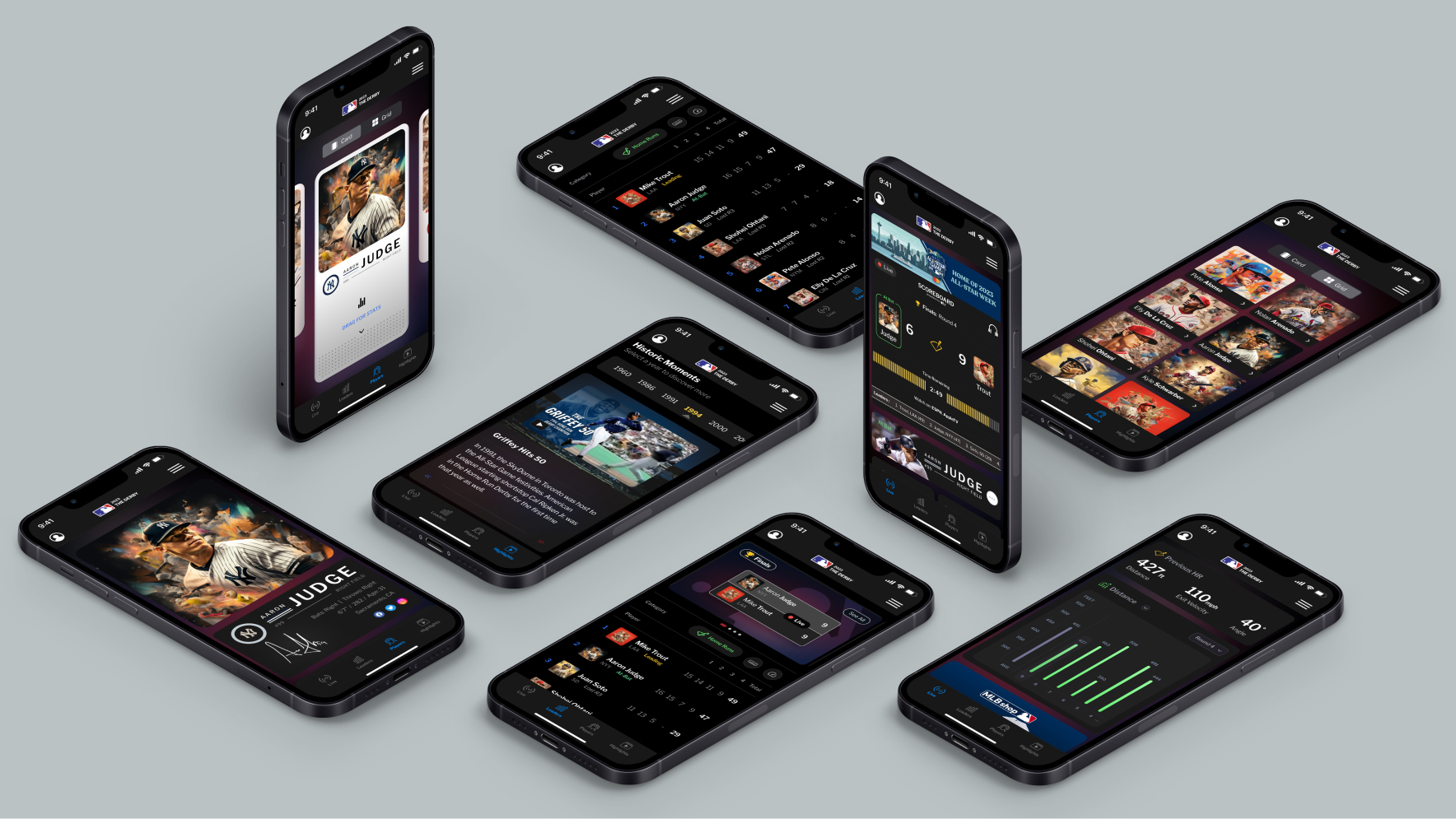
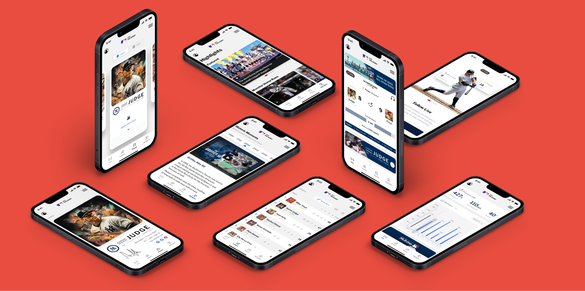
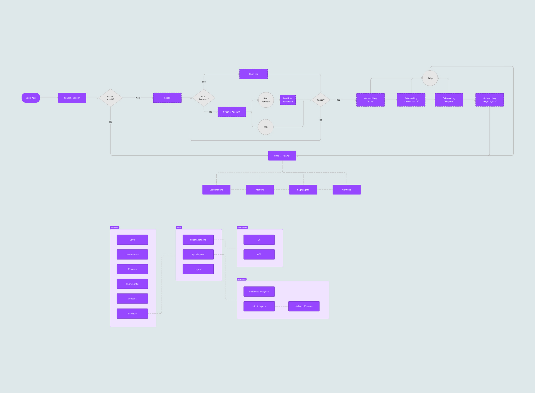
I began by organizing and assembling the user flow of the full experience. Once this was complete I then translated each component of the experience into low-fidelity sketches. New ideas naturally presented themselves following this. I then digitized and iterated on these drawings to build my wireframes that would be the starting blocks of my build. Below you can find samples of each step:
Design Process
Visual Direction
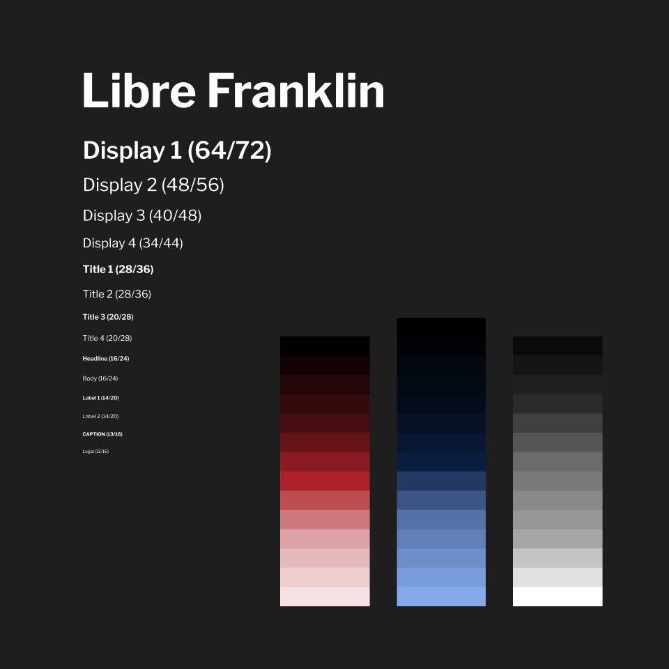
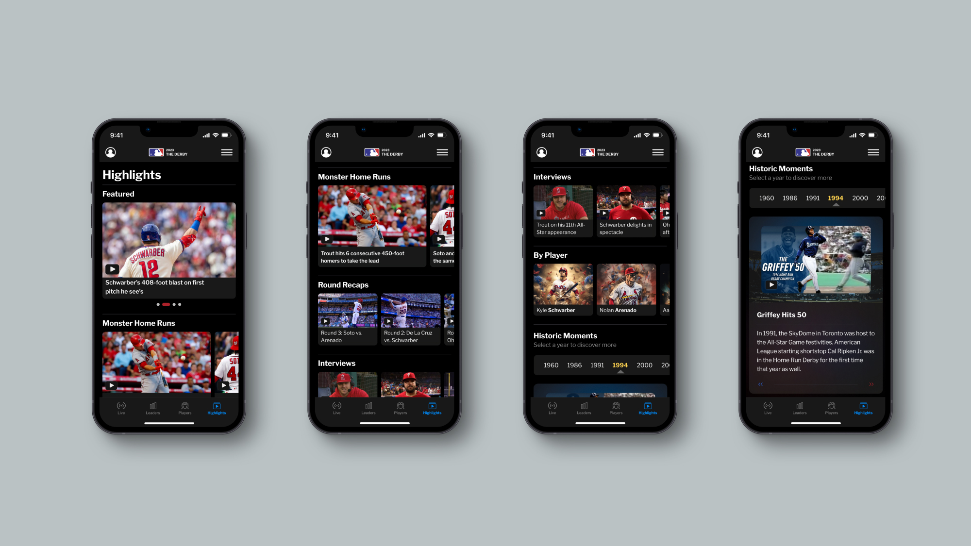
I wanted this app to live harmoniously within the MLB ecosystem, so I didn't want to stray too far from their existing brand guidelines currently in place, but it was important to still stretch my vision by painting outside the lines where I felt it necessary. Though they were not explicitly provided, I was able to emulate their typeface fairly accurately by subtituting it with Libre Franklin. The red (#BF0D3E), white (#FFFFFF), and blue (#041E42) palette made for an intuitive color scheme for the default light mode.
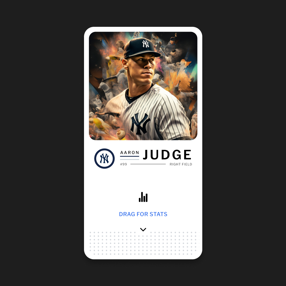
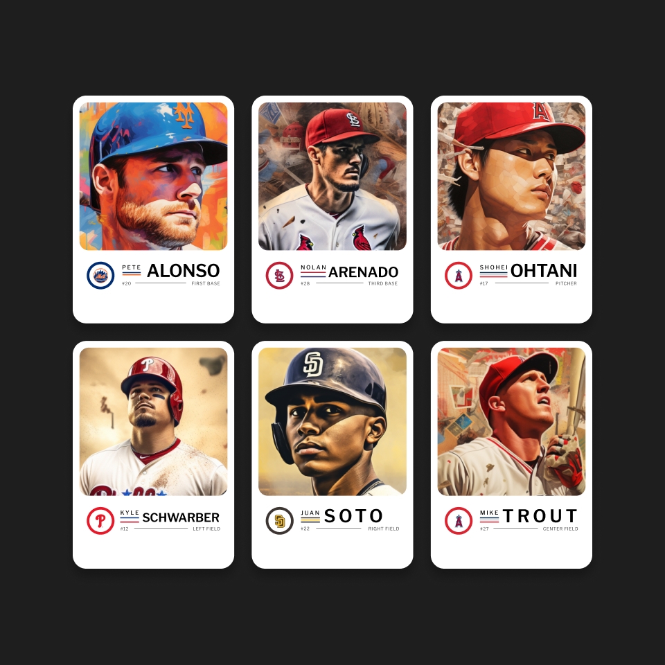
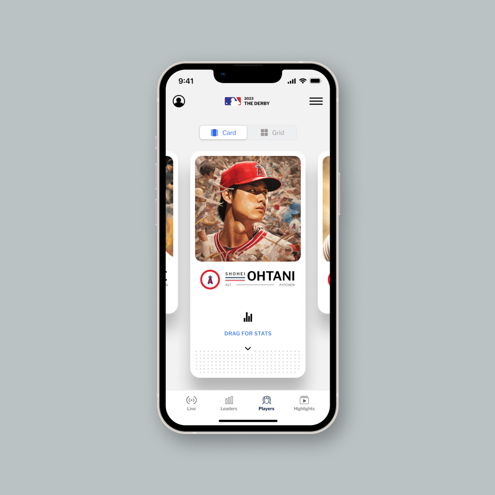
I wanted to give the dark mode some added flavor, so I explored using layer blurs and burns of the palette to create a sexy and elegant alternative. I saw the player profile cards as an excellent opportunity to magnify the supernatural qualities of the competitors in the style of a traditional Topps baseball card, as compared to the homogenous, one-size fits all approach currently used by the MLB (e.g. headshot on a white background).
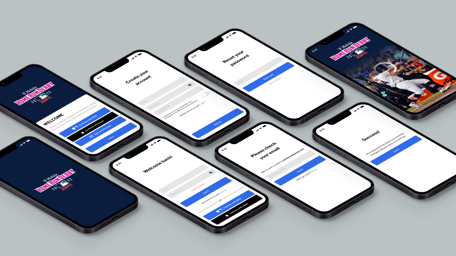
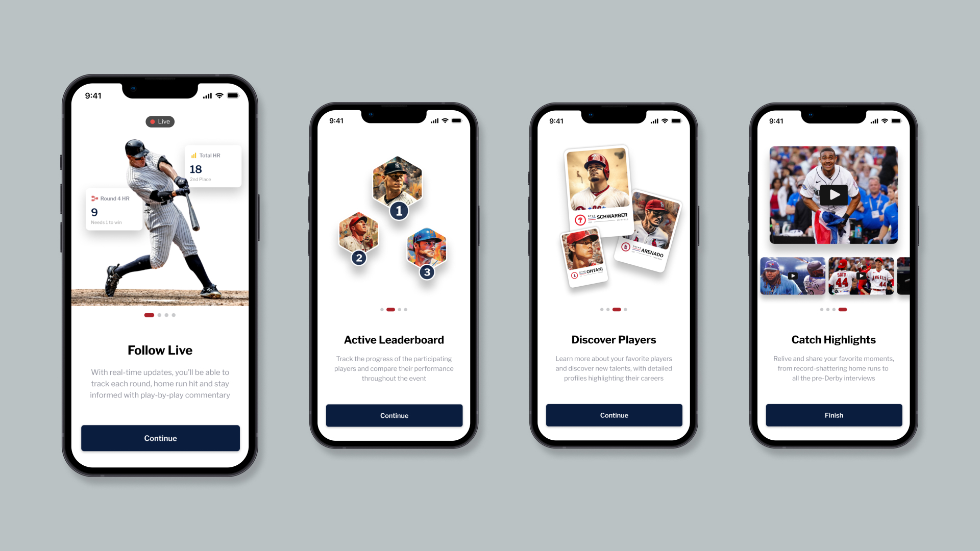
First-Visit
Login & Onboarding
Given the limited shelf-life of the 2 hour event it was key to sign-up users quickly, including SSO best-practives, followed by providing a set of informative animated screens, each representing a core page of the app, to set expectations and confidence in exploration before dropping them directly into the experience.
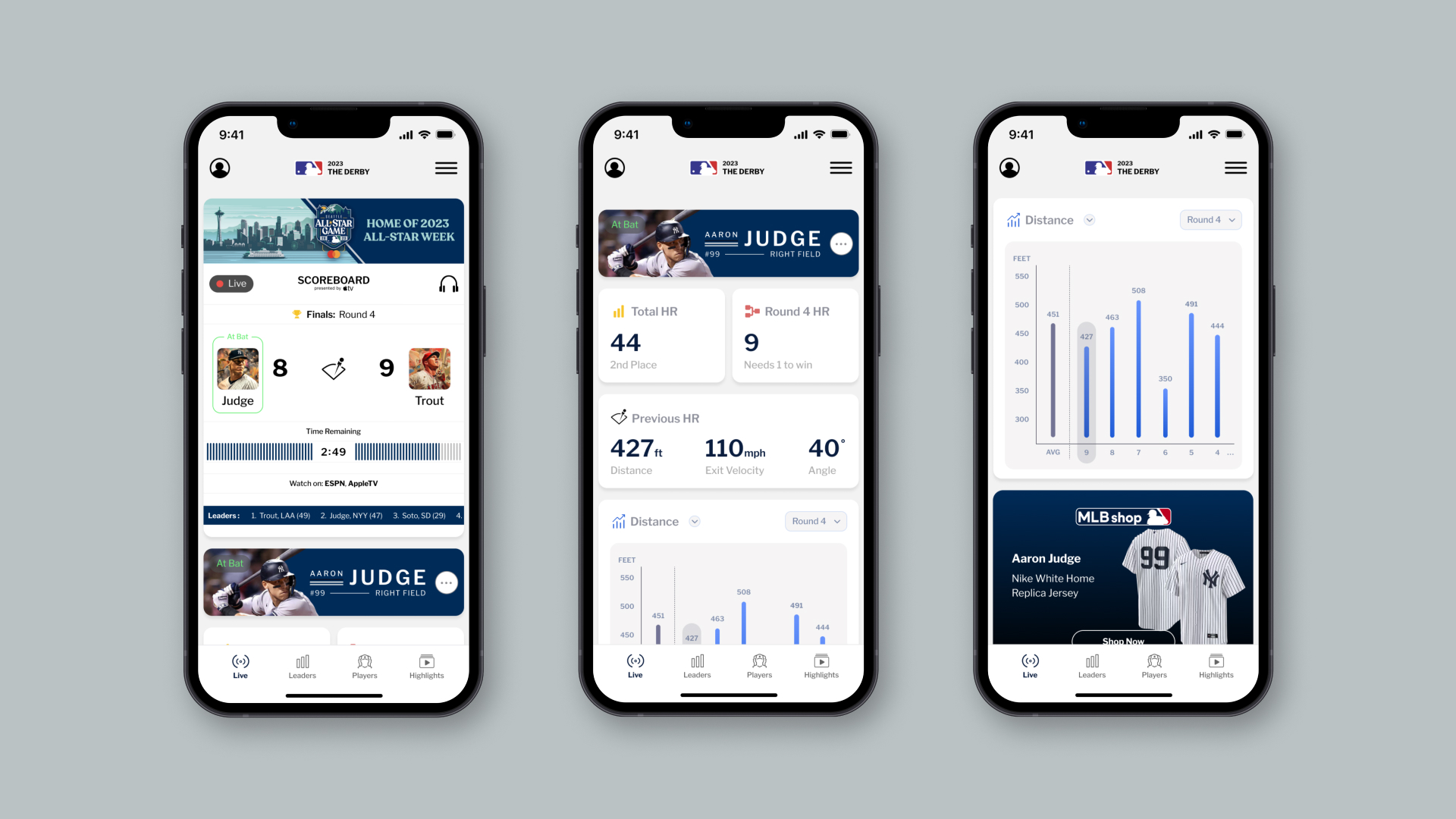
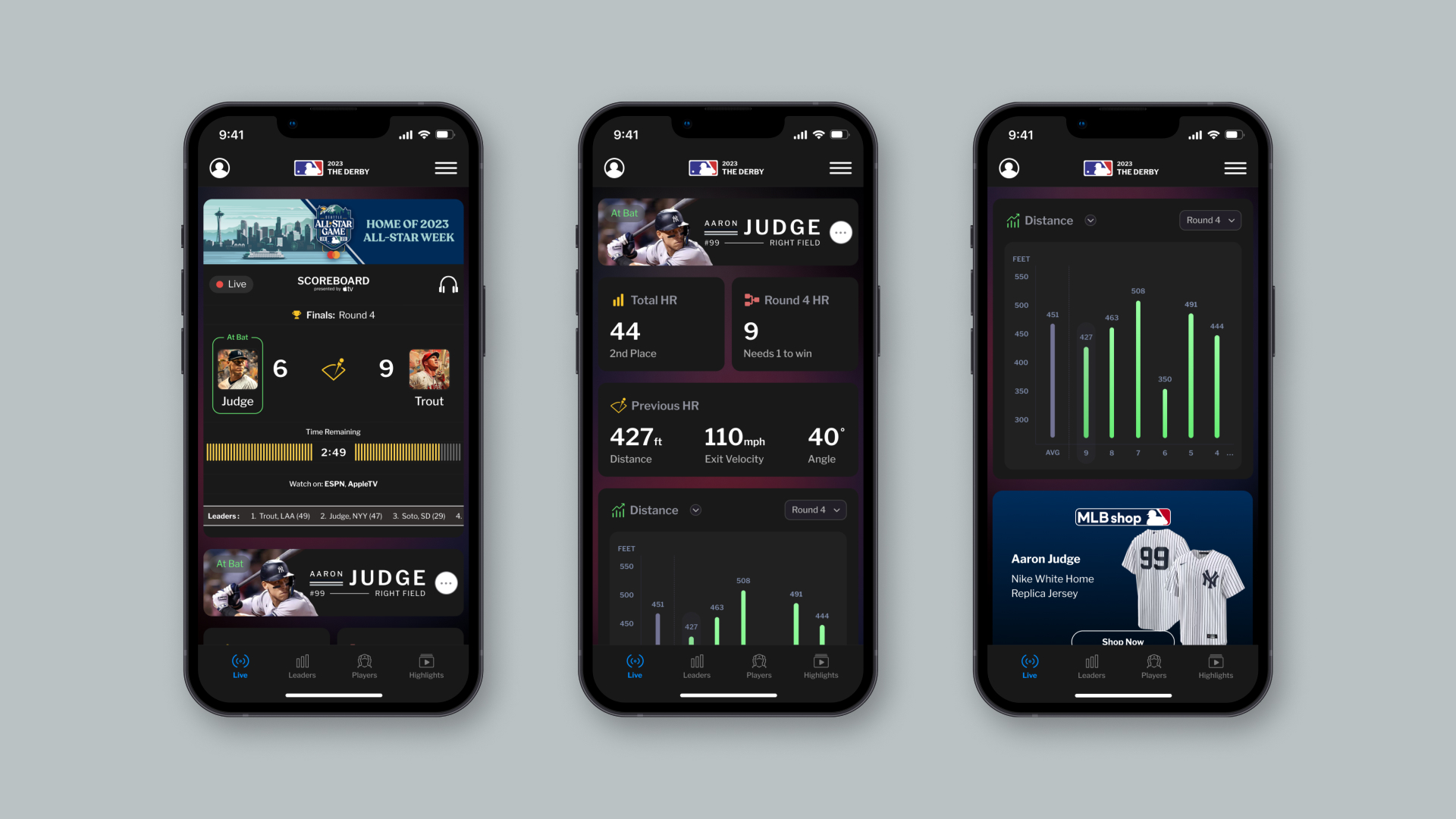
Engage & Inform
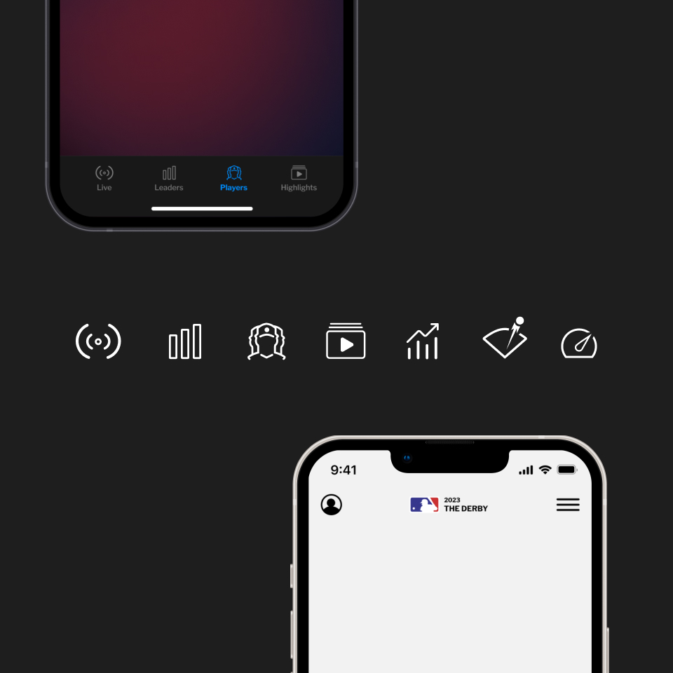
Live Scoreboard
The overarching goal to keep fans engaged and informed throughout the event. Following these principles I set out to provide real-time updates of the event in the form of a handheld scoreboard, with what I designated as required data points for my audience. These included:
- The round of the single elimination event
- The batters competing in the event
- Count of HR for each competitor
- Time remaining in the at-bat
In addition I wanted to provide relevant status for the most recent home run hit by the hitter at-bat (distance, exit velocity, launch angle), as well as a detailed summary of historic data for each home run hit throughout the round, and preceding rounds. Given MLB’s existing Statcast metrics provided during live games, this felt like an achievable system to integrate for this app.
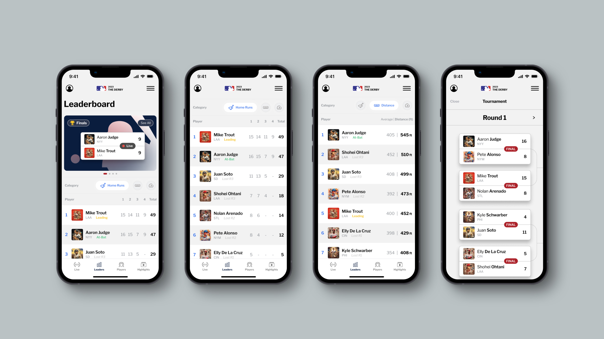
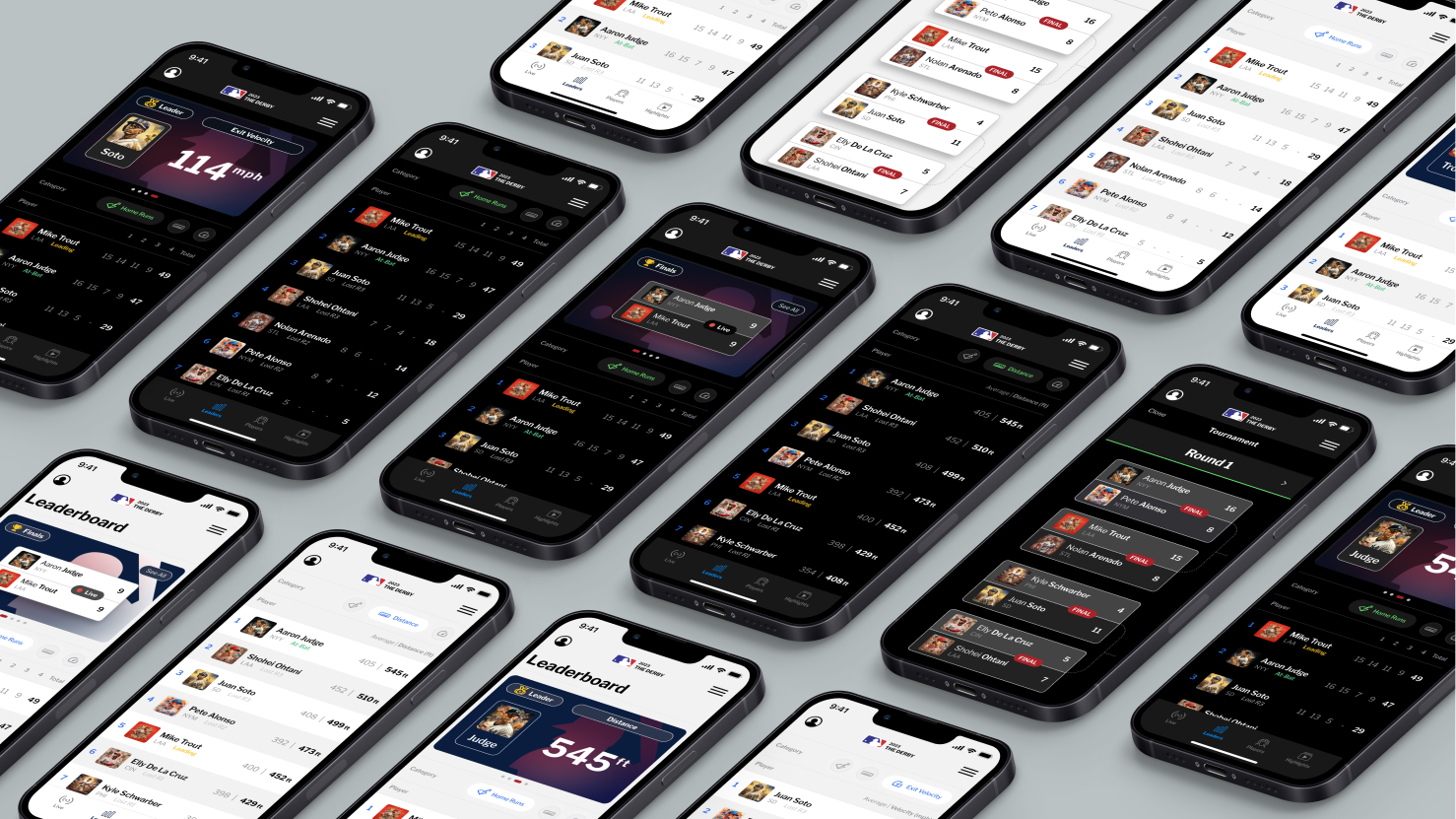
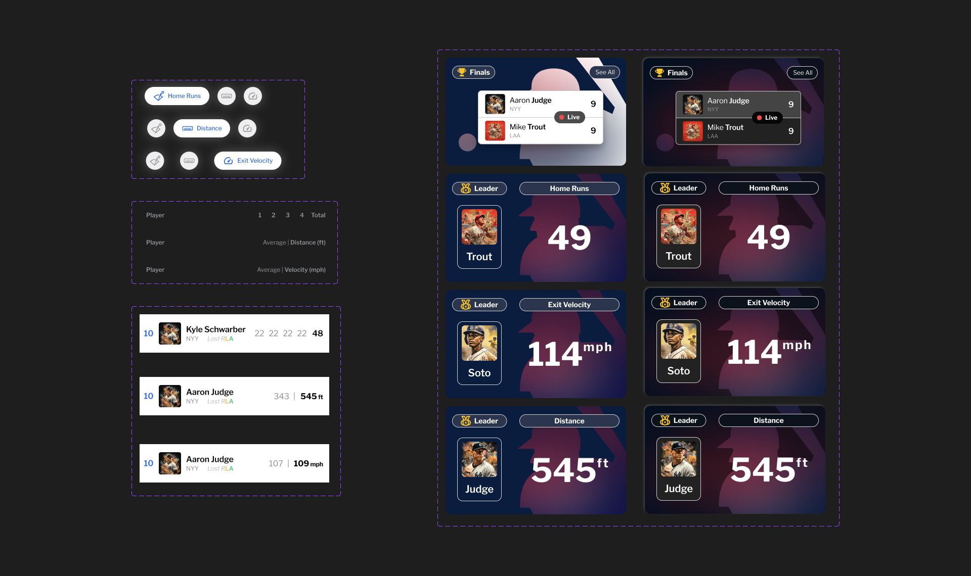
Build Anticipation
Leaderboard
Given the competitive nature of the event I wanted to build continued anticipation during the event, allowing users to track the progress of all participating players and compare their performance throughout the event. While the event has one winner, fans are always interested in his individual feats tied to specific data points (e.g. furthest home run hit), so I wanted that information easily available to my users.
The purpose of this screen was to allow users to track and compare the competitors progress throughout the entire event in an elegant leaderboard. While the event has a single winner, I wanted to elevate the other competitive elements of the event, most notably 1) Distance and 2) Exit Velocity, which demonstrate the brawn and skill of the competitors. User’s can easily filter the data by the category of greatest interest to themselves.
Discover & Learn
Player Profiles
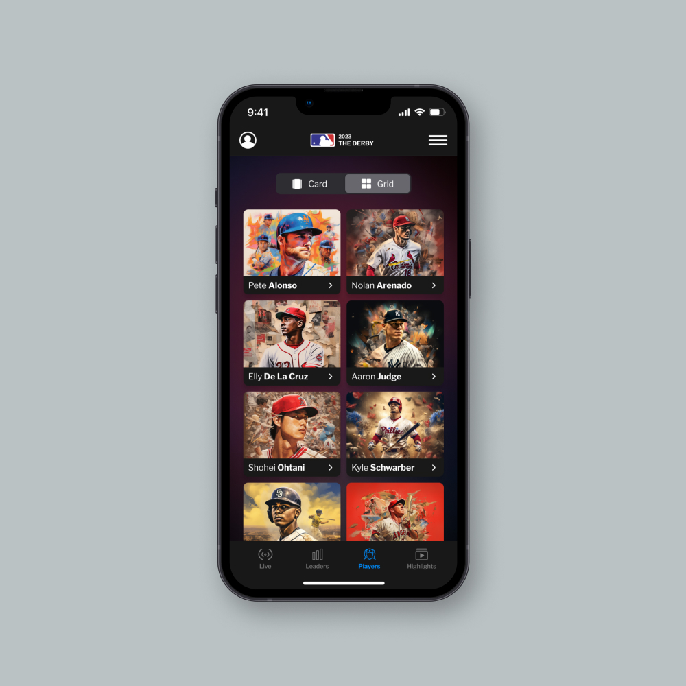
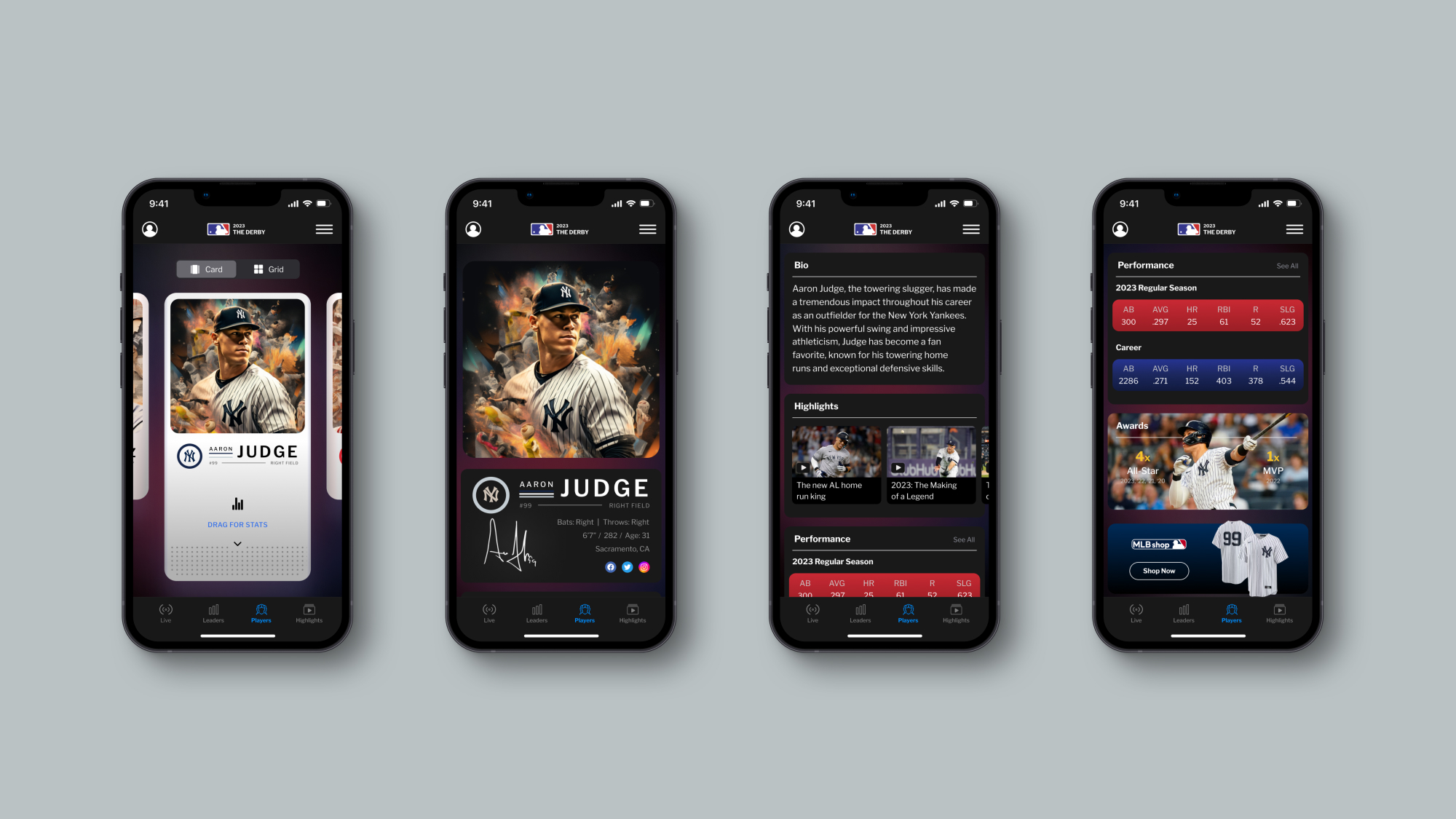
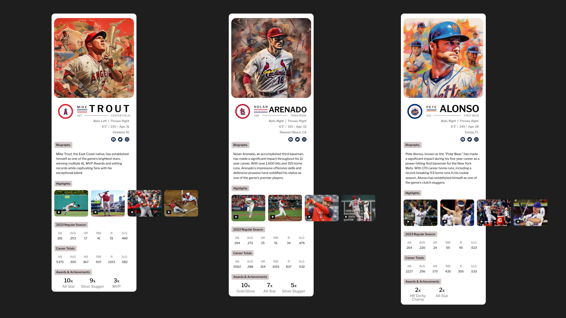
Player discovery was a core mission for this experience. To heighten the experience, I wanted this screen to feel like opening a fresh pack of Topps baseball cards with heroic images of each competitor that users can “flip” through. For accessibility reasons, I provided users with a contextual grid view toggle if wanting to quickly get to a player of interest. After a player card was selected, the user was directed to their dedicated profile where they were invited to learn more about each (biographical data, highlights, statistics).
I also provided their social links with the objective that if a user is “following” the personality, then they are inadvertently following the sport. Additionally, I provided in-app merchandise links targeted for each specific player that could display alternative memorabilia depending on page visit for fans to conveniently support their favorite teams and players.
Relive & Reshare
Highlights
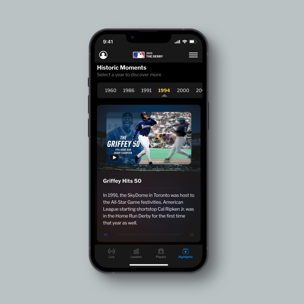
Given the rapid nature of the event (especially on television) I wanted to give users the director’s seat to relive the magic of the event. If a user’s favorite player was eliminated earlier or another player hit the farthest home earlier in the event, I wanted these moments available at the user’s finger tips. As can be inferred from MLB’s existing app, this can be achieved. By taking the “hunt” for these moments via (YouTube, ESPN, or secondary source) out of the equation there is an opportunity to serve them directly for users to enjoy and share.
Additionally, I saw an opportunity to infuse historical moments of the event over the years with a timeline feature to house short-form produced content that would allow older generations to revisit moments they may have forgotten and allow a younger generation to see how the event has evolved.
Testing
Prototype
As an added challenge links were added between screens to make the flow more believable, along with animations to add a sense of fluidity and moments of delight. The final result is a working model that feels like a real app, ready to review with stakeholders. Test out the app for yourself from beginning to end in Figma below.
*Due to sizing constraints this prototype is limited to Desktop users only.
Lessons
Takeaways
Overall, I’m really proud of my final result at building a fully interactive app, integrating 21st century tech into a 19th century game. I think the concept and investment by the MLB holds water in delighting fans and serving them event-specific data that differentiates from their suite of MLB apps and helps to elevate the televised event to grow fandom. Furthermore, I see how this could be recycled year after year and iterated upon with relatively low lift.